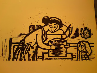
So thanks to the wonders of Photoshop and lots of fiddling around, I changed it again. I think this works better, no? Also made the red a bit more orange, so it doesn't come across as being too aggressive. This is aimed at small children after all heh.
 Re-reworked image.
I'm also fiddling around with text placement and different fonts, but I'm really no good at this. Contacted a graphic design teacher to hopefully help me, but so far no response. Wish I was good at typography!
Also have a big presentation about this project tomorrow. So very nervous! Keep your fingers crossed for me please! =P
Also have a big presentation about this project tomorrow. So very nervous! Keep your fingers crossed for me please! =P


